
 English
 Dutch
Dutch French
 Greek
Greek Italian
 Spanish
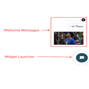
Understanding Chat Widget launcher:
- Widget Launcher:
- Whenever the Widget loads on any webpage, first it will show a small chat widget bubble, generally on the bottom left or right corner.
- It is possible to set the animations on this launcher button
- Welcome Messages:
- These are the configurable welcome messages which will be displayed with the launcher whenever the widget gets loaded
- Various types of welcome messages can be configured with a maximum limit of up to 4.
- Text welcome message: This will simply show the plain text. Like “How can I help!”, “Hi There”.
- Image / GIF / Video: This will allow showing media in welcome messages. Refer screenshot below where GIF is shown in the welcome message
Let’s understand how to customize the chat widget launcher with welcome messages.
- Setting Welcome Messages:
- Go to Builder -> choose “3. Settings” from builder navigation -> Choose “Widget Settings”
- Go to section -> “Widget – Welcome Message” -> check the checkbox. This will enable the other options to set the welcome messages.
- Check/uncheck the close option – This is to show or hide the close button on the top right corner of the welcome messages.
- Next, add a combination of any 4 types of messages.
- Here you can add plain text messages, GIFs, Images, or Videos.
- Setting Widget launcher animation:
- Go to section -> “Widget Animation” and select the animation of your choice
- If you uncheck the “widget animation” then there will be no animation and the output will have a static widget bubble
- Launch criteria for the welcome message:
- Here you can set the percentage value for the scroll. It means when the user scrolls a webpage and matched the percentage of scroll then the welcome message will be shown.
- For Example; if the value is 50% then welcome messages will only appear when the user scrolls the website by 50%.
- Page URL:
- Here you can add a list of URLs where welcome messages are to be shown.
- It is possible to show welcome messages only on a specific page
- If you don’t put anything here, it means by default welcome messages will be shown on all pages
- Setting Welcome Messages:
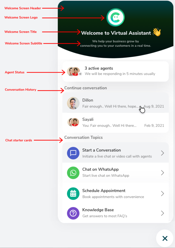
Understanding Chat Widget Welcome Screen:
The welcome screen if activated is the first thing user will see when they click on the widget launcher
Let’s understand how to customize the chat widget welcome screen
- Setting up Welcome Screen:
- Go to Builder -> choose “3. Settings” from builder navigation -> Choose “Widget Settings”
- Go to section -> “Welcome Screen” -> check the checkbox. This will enable the other options to configure the welcome screen.
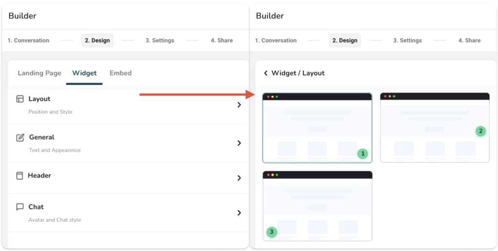
- Choose Layouts: Here select one of the 3 welcome screen layouts for the output
- Welcome Screen Image:
- Upload a logo of your company to show as the “Welcome screen logo”.
- Use the “Scale” option to set the scale of your logo. It is helpful to make your square logo into a round shape.
- Category labels:
- Start a conversation – This is used to relabel the main category text for all chat starter cards. Like in the screenshot above instead of “Conversation Topics” you can use “Use options below to start”
- Active agents: Show or hide the Active agent card
- You can also adjust the text for Online and Offline status here
- Continue the conversation – This card will show the existing chat sessions from the history for the user visiting from the same machine and browser
- Search for help – use this card to show the top 3 knowledge articles. Clicking on the search bar here allows you to get the full list of all articles available.
- Chat starter cards:
- Start a conversation – This is used to start the chat conversation. By clicking on this card, the user will be able to have a chat conversation on the widget chat page. You can rename it like “Chat now” or “Start a chat with us” etc.
- WhatsApp –
- Use this to configure the WhatsApp redirect link
- When the user clicks on the WhatsApp card, it will directly open the web WhatsApp or Desktop app of WhatsApp
- You can set the color and adjust the text label as per your need
- Appointment –
- Use this to configure the external calendar links and open them on click
- This is very helpful if you want to redirect the user to your calendar like Calendly etc.
- Knowledge Base –
- Use this card to show the knowledge article list
- Users can click on it and explore all available knowledge articles.
- Setting up Welcome Screen:
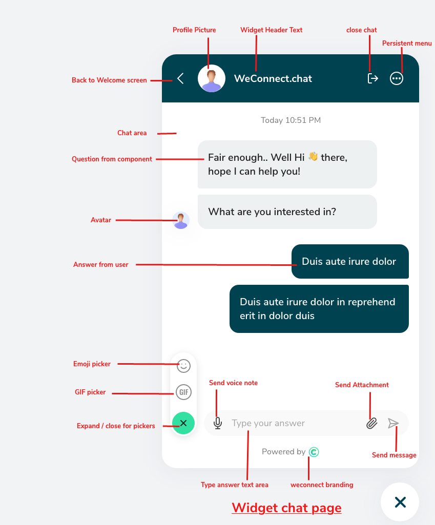
Understanding Chat details page:
Here user will be interacting with to chat interface as a conversation. This is also used to do live chat.
Adjusting appearances for the Welcome screen and chat details page:
Here you will be able to adjust the appearances of chat widget output like colors, typography, etc.
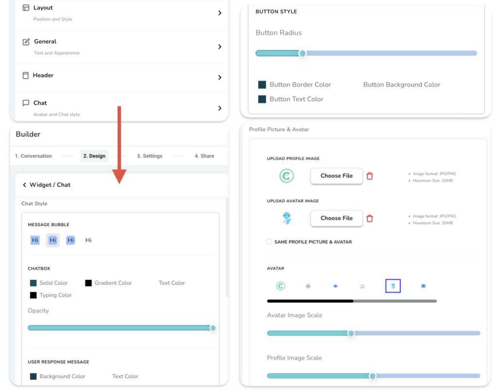
- Layout
- Use this to select the position of the chat widget launcher.
- Three positions are available Left Bottom corner, Right bottom corner, and Right center of the screen.
- Most commonly used are bottom corner positions
- General
- Text: Use this to configure the typography like; Font, Font size, and Font weight (bold or regular)
- Settings: Use this to show/hide the progress bar, you can also set the color of the progress bar
- Progress bar is shown to users when they interact with the chat interface on the chat details page, and it progresses based on several questions answered.
- Chat branding: Use this to show/hide the WeConnect.chat branding on the footer of the chat widget.

- Header
- Use this to control the header appearances for the welcome screen and chat details page
- Title: Use to update the title like “Hi There!”
- Header Subtitle: Use this to update the header subtitle. This is applicable only on the welcome screen like “How can I help you”
- Color: Use this to change the header color and header text color.
- Use from chatbox: Use this option if you want to keep the same color as chat components. We will see this in the next point in detail.

- Chat
- Chat style -> Message Bubble: Use this to change the shape of component output on the chat details page
- Chat style -> Chatbox: Use this to adjust the color appearances of component output.
- Solid color: Use this to set the solid color of the component
- Gradient color: Use this to set the gradient color of the component
- Text color: Use this to set the solid color of the text displayed on the component
- Typing color: Use this to set the color of typing animation
- Opacity: Use this to adjust the opacity of widgets on the website. Use the slider to set opacity as per your need.
- Chat style -> User response message:
- Background color: This will set the background color of the user response
- Text Color: This will set the text color for the user response
- Chat style -> Button style: This is to configure the appearances of buttons shown in the output. Buttons are shown in some specific components like, multiple choice, carousel, etc.
- Button Radius: This will set the corners of a button. Use this to show circular buttons like oval or rectangular shapes.
- Button border color: This will set the border color of the button
- Button background color: This will set the background color of the button
- Button Text color: Use this to set the text color of the button.
- Profile picture & avatar:
- Profile picture: Use this to apply the picture (logo) to the header of a chat details page
- Avatar: This is the picture shown near the question when it appears on the chat details page. You can upload your own avatar image or use some options available.
- Image scale: Use this to change the scale of the avatar and profile pic. This is helpful to make images either round or square.