
 English
 Dutch
Dutch French
 Greek
Greek Italian
 Spanish
Landing page is the full page chat interface, this will be accessible from dedicated URL which can be accessed from any device.
Let’s start with customising the Landing page appearance.
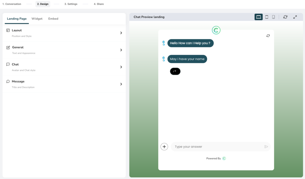
Adjusting appearances for the Landing page:
Here you will be able to adjust the appearances of the Landing page output like colorography, typography, background etc.
- Layout
- Use this to select the layout of landing page.
- There are three layouts available to choose.
- First layout is the most suitable for desktop and mobile displays.
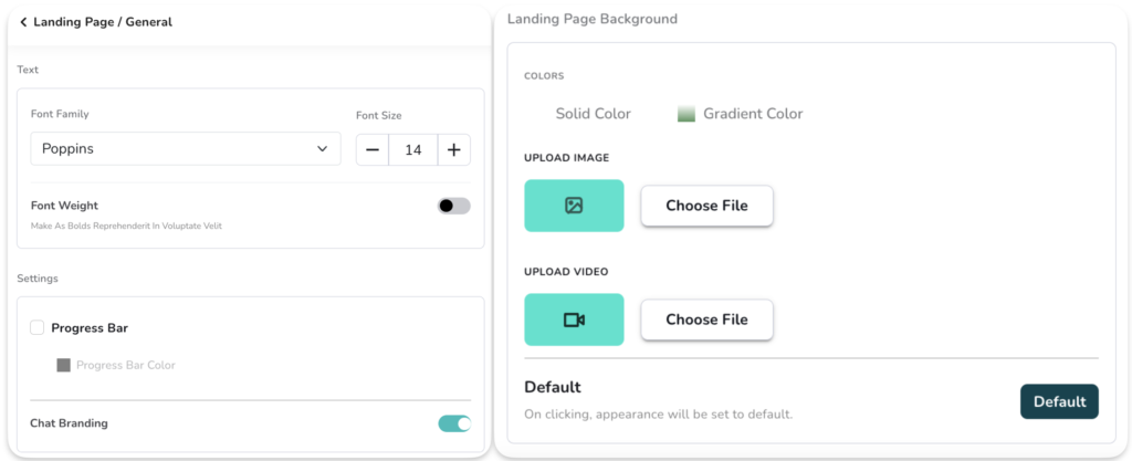
- General
- Text: Use this to configure the typography like; Font, Font size and Font weight (bold or regular)
- Settings: Use this to show/hide the progress bar, you can also set the color of the progress bar
- Progress bar is shown to user when they interact with chat interface in landing page, and it progresses based on number of questions answered out of all.
- Chat branding: Use this to show/hide the WeConnect.chat branding on footer of the landing page.
- Landing page background: Use this to set the background of landing page. There are four types of backgrounds are available. Like, Solid color, gradient color, image and video as a background.
- Default: Use default button to reset the default colors and appearances settings.
- Chat
- Chat style -> Message Bubble: Use this to change the shape of component output.
- Chat style -> Chatbox: Use this to adjust color appearances of component output.
- Solid color: Use this to set the solid color of the component
- Gradient color: Use this to set the gradient color of the component
- Text color: Use this to set the solid color of the text displayed on component
- Typing color: Use this to set the color of typing animation
- Opacity: Use this to adjust the opacity of landing page. Use slider to set opacity as per your need.
- Chat style -> User response message:
- Background color: This will set the background color of the user response
- Text color: This will set the text color for the user response
- Chat style -> Button style: This is to configure the appearances of buttons shown in output. Buttons are shown in some specific components like, multiple choice, carousel etc.
- Button Radius: This will set the corners of a button. Use this to show circular buttons like oval or rectangular shape.
- Button border color: This will set the border color of button
- Button background color: This will set the background color of button
- Button Text color: Use this to set the text color of the button.
- Profile picture & avatar:
- Profile picture: Use this to apply the picture (logo) to be shown in the landing page
- Avatar: This is the picture shown near question when it appears on output. You can upload your own avatar image or use from some options available.
- Image scale: Use this to change the scale of avatar and profile pic. This is helpful to make image either round or square.
- Message
- This is mainly applicable to second and third layout of landing page
- Landing page creates the dedicated URL, Meta information is necessary to get these url’s crawled by SEO. Or at least whenever you share the Landing page it can generate the Meta preview.
- Title: Use to update the title like “Hi There!”
- Subtitle: Use this to update the subtitle. This is applicable only on the second and third layout like “How can I help you”
- Meta Title: Use this to change the header color and header text color.
- Meta Description: Use this option if you want to keep same color as chat components. We will see this in next point in detail.
