Help Center
Home > Help Center > Customise Chat Interface > Customise Chat Widget
Customise Chat Widget
Let’s start with customising the chat widget appearance.
Understanding Chat Widget launcher:
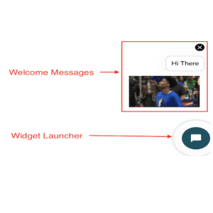
- Widget Launcher:
- Whenever Widget loads on any webpage, first it will show a small chat widget bubble, generally on bottom left or right corner.
- It is possible to set the animations on this launcher button
- Welcome Messages:
- These are the configurable welcome messages which will be displayed with launcher whenever widget gets loaded
- Various types of welcome messages can be configured with maximum limit upto 4.
- Text welcome message: This will simply show the plain text. Like “How can I help!”, “Hi There”.
- Image / GIF / Video: This will allow to show media in welcome messages. Refer screenshot below where GIF is shown in welcome message
Let’s understand how to customise chat widget launcher with welcome messages.
- Setting Welcome Messages:
- Go to Builder -> choose “3. Settings” from builder navigation -> Choose “Widget Settings”
- Go to section -> “Widget – Welcome Message” -> check the checkbox. This will enable the other options to set the welcome messages.
- Check / uncheck the close option – This is to show or hide the close button on top right corner of the welcome messages.
- Next, add combination of any 4 types of messages.
- Here you can add plain text message, GIF, Image or Video.
- Setting Widget launcher animation:
- Go to section -> “Widget Animation” and select the animation of your choice
- If you uncheck the “widget animation” then there will be no animation and output will have a static widget bubble
- Launch criteria for welcome message:
- Here you can set the percentage value for the scroll. It means when user scrolls a webpage and matched the percentage of scroll then welcome message will be shown.
- Example; if value is 50% then welcome messages will only appear when user scrolls the website by 50%.
- Page URL:
- Here you can add list of URL’s where welcome messages to be shown.
- It is possible to show welcome messages only on specific page
- If you don’t put anything here, it means by default welcome messages will be shown on all pages
- Setting Welcome Messages:
Understanding Chat Widget Welcome Screen:
Welcome screen if activated this is the first thing user will see when they click on widget launcher
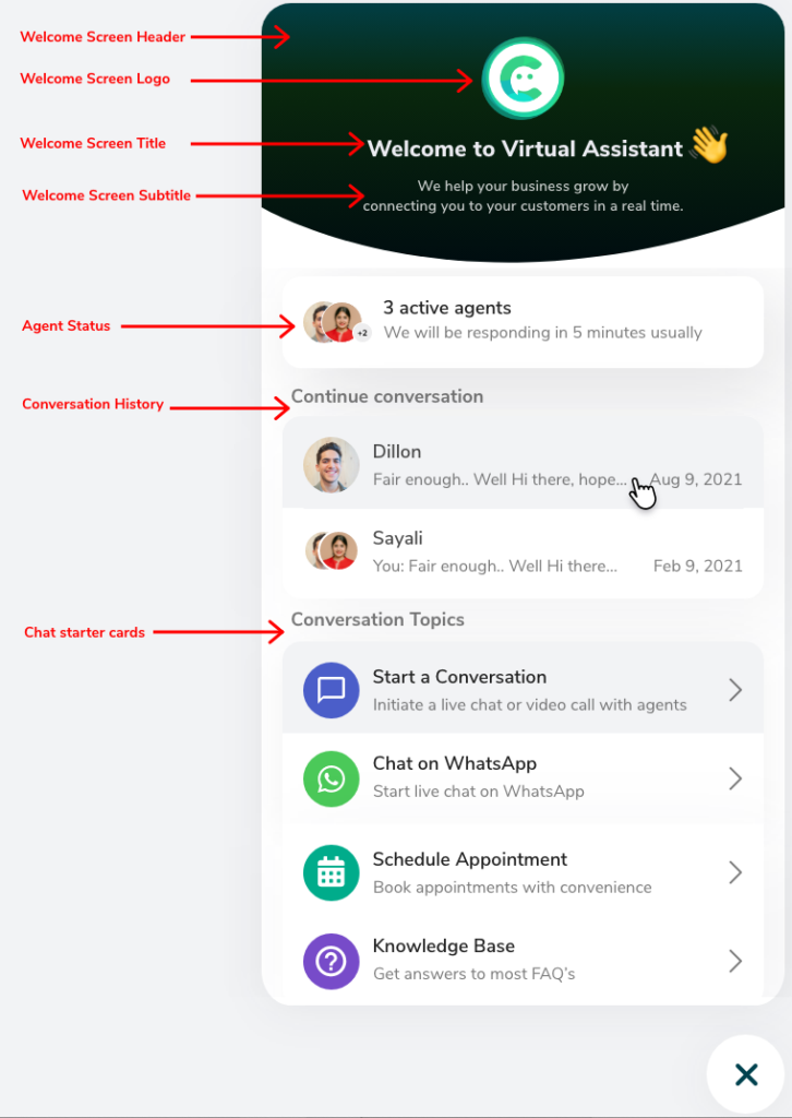
Let’s understand how to customise chat widget welcome screen
- Setting up Welcome Screen:
- Go to Builder -> choose “3. Settings” from builder navigation -> Choose “Widget Settings”
- Go to section -> “Welcome Screen” -> check the checkbox. This will enable the other options to configure the welcome screen.
- Choose Layouts: Here select one of the 3 welcome screen layouts for the output
- Welcome Screen Image:
- Upload a logo of your company to show as the “Welcome screen logo”.
- Use “Scale” option to set the scale of your logo. It is helpful to make your square logo into round shape.
- Category labels:
- Start a conversation – This is used to relabel the main category text for all chat starter cards. Like in screenshot above instead of “Conversation Topics” you can use “Use options below to start”
- Active agents: Show or hide the Active agent card
- You can also adjust the text for Online and Offline status here
- Continue conversation – This card will show the existing chat sessions from the history for the user visiting from same machine and browser
- Search for help – use this card to show the top 3 knowledge articles. Clicking on search bar here allows to get the full list of all articles available.
- Chat starter cards:
- Start a conversation – This is used to start the chat conversation. By clicking on this card, user will be able to have a chat conversation on widget chat page. You can rename it like “Chat now” or “Start chat with us” etc.
- WhatsApp –
- Use this to configure WhatsApp redirect link
- When user click on whatsApp card, it will directly open the web whatsApp or Desktop app of WhatsApp
- You can set the color and adjust the text label as per your need
- Appointment –
- Use this to configure the external calendar links and open them on click
- This is very helpful if you want to redirect user to your calendar like Calendly etc.
- Knowledge Base –
- Use this card to show the knowledge article list
- Users can click on it and explore all available knowledge articles.
- Setting up Welcome Screen:
Understanding Chat details page:
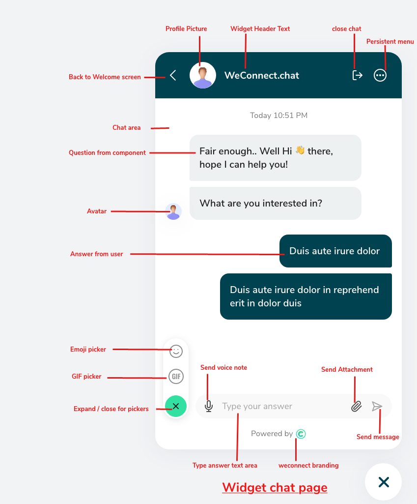
Here user will be interacting to chat interface as a conversation. This is also used to do the live chat.
Adjusting appearances for the Welcome screen and chat details page:
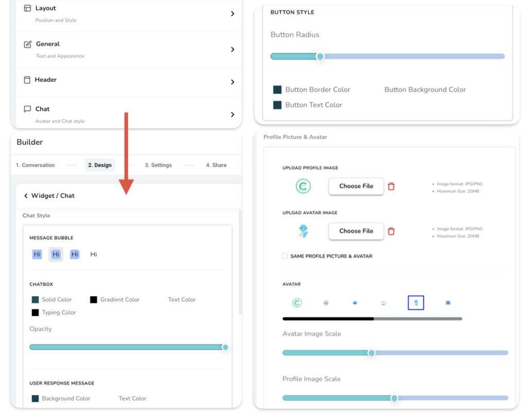
Here you will be able to adjust the appearances of chat widget output like colorography, typography, etc.
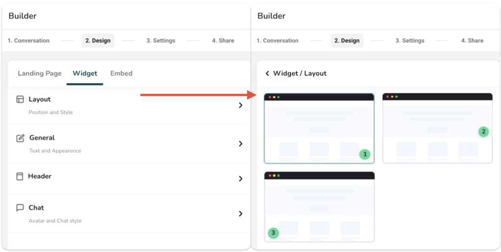
- Layout
- Use this to select the position of chat widget launcher.
- Three positions are available Left Bottom corner, Right bottom corner and Right center of the screen.
- Most commonly used are bottom corner positions
- General
- Text: Use this to configure the typography like; Font, Font size and Font weight (bold or regular)
- Settings: Use this to show/hide the progress bar, you can also set the color of the progress bar
- Progress bar is shown to user when they interact with chat interface in chat details page, and it progresses based on number of questions answered out of all.
- Chat branding: Use this to show/hide the WeConnect.chat branding on footer of the chat widget.

- Header
- Use this to control the header appearances for welcome screen and chat details page
- Title: Use to update the title like “Hi There!”
- Header Subtitle: Use this to update the header subtitle. This is applicable only on the welcome screen like “How can I help you”
- Color: Use this to change the header color and header text color.
- Use from chatbox: Use this option if you want to keep same color as chat components. We will see this in next point in detail.

- Chat
- Chat style -> Message Bubble: Use this to change the shape of component output in chat details page
- Chat style -> Chatbox: Use this to adjust color appearances of component output.
- Solid color: Use this to set the solid color of the component
- Gradient color: Use this to set the gradient color of the component
- Text color: Use this to set the solid color of the text displayed on component
- Typing color: Use this to set the color of typing animation
- Opacity: Use this to adjust the opacity of widget on website. Use slider to set opacity as per your need.
- Chat style -> User response message:
- Background color: This will set the background color of the user response
- Text color: This will set the text color for the user response
- Chat style -> Button style: This is to configure the appearances of buttons shown in output. Buttons are shown in some specific components like, multiple choice, carousel etc.
- Button Radius: This will set the corners of a button. Use this to show circular buttons like oval or rectangular shape.
- Button border color: This will set the border color of button
- Button background color: This will set the background color of button
- Button Text color: Use this to set the text color of the button.
- Profile picture & avatar:
- Profile picture: Use this to apply the picture (logo) to header of a chat details page
- Avatar: This is the picture shown near question when it appears on the chat details page. You can upload your own avatar image or use from some options available.
- Image scale: Use this to change the scale of avatar and profile pic. This is helpful to make image either round or square.
