
 English
 Dutch
Dutch French
 Greek
Greek Italian
 Spanish
This is a unique component that allows you to highlight the conversation to grab the attention.
This can also be used at the start of the chat script to drive the conversation flow. You can provide the choices to the customer to initiate the conversation.

Chat Message
- Write your own message to show to the visitor; e.g; “Hi 👋 I am Kaiwa, your personal assistant!
- Additionally you can show buttons ‘Skip, and ‘back’

Edit Card
Here you will be able to customise the appearance of welcome card output;
- Text color
- Card color
- Gradient color
- Image to be shown inside card
Use “Default” button to reset the default appearances.

Adding Button & button styles
Choices are the buttons or chips which are shown to visitor to interact with.
Next Add choices to show to the visitor to continue the conversation; e.g. “Chat with agent, Just browsing, Need help”
- Select button style from dropdown
- You can also provide hyperlink to any external URL on any choice. Check new tab if you want to open link in new tab in browser.
- Finally, save the component settings by pressing ‘Save’ button
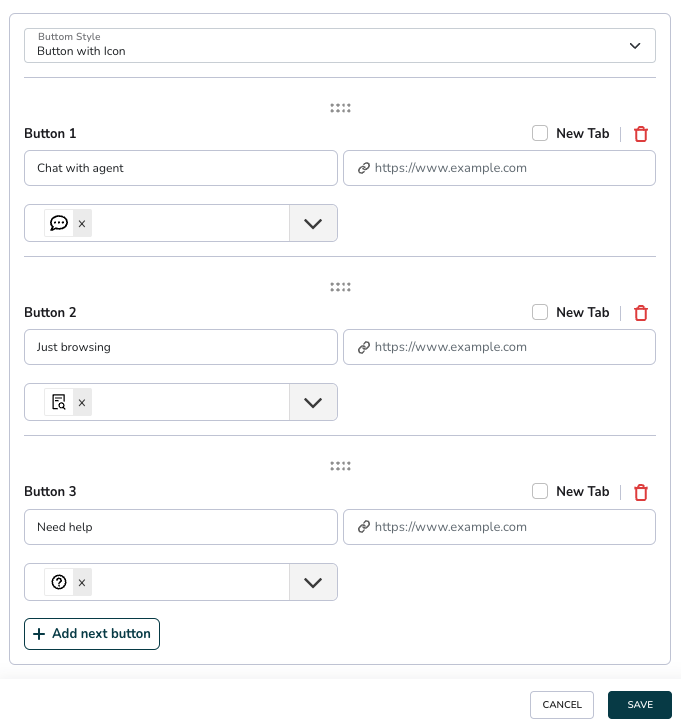
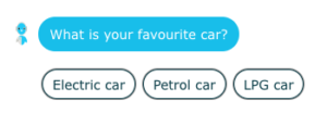
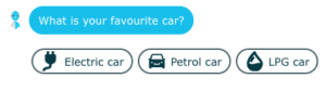
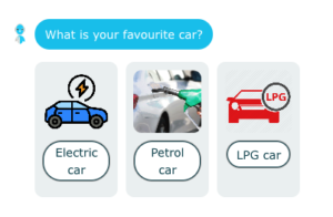
There are three types of button styles are supported to show choices:
1.Chips
2.Buttons with icon
3.Button with image